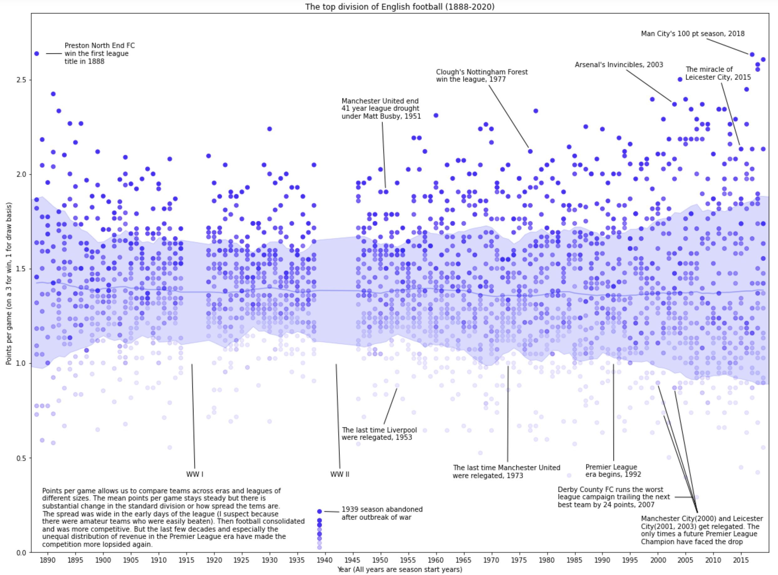
I built this graph a while ago partly because I came across the data one afternoon when I was bored, but partly because I was prepping to teach dataviz. I wanted an exercise for students where they could start out with a large amount of data on a single graph and then have a conversation about what salient points they would pick out to outline the long arc of history that the data covers.
I scaled up all games to the modern 3 points for a win and 1 for a draw scoring system to make comparison across eras easier. The band in the middle maps the standard deviation of the distribution of points and tells its own story. We see the consolidation of English soccer in the early days where the wide deviation could be explained by the presence of weaker amateur teams in the league who were then gradually eliminated. In more recent decades we see the influx of TV rights and more and more money culminating in the Premier League era resulting in wider margins yet again.
Some of the things we discussed about the visualization in class: Does the anecdotal and arbitrary selection of points enrich our sense of the data? Does it impose a modern bias on the data that is distortive? Would this work better as an interactive visualization – what interactive features would you add?
We also practiced our data cleaning and formatting skills in class by using the same dataset to create the following animated visualization using an online visualization portal. It shows the cumulative number of points earned by clubs over time under a uniform 3 for win, 1 for draw system. I was surprised to see that Sunderland, Villa, and Everton were the most successful English clubs until the 1970s, and Everton wasn’t toppled from it’s most cumulative points position until 2005!