This post grew out of some interesting discussions on data-visualization in a class I taught. I will use data on test cricket matches played by all the major cricketing nations gathered from Cricinfo’s Statsguru database to hastily sketch a couple of points, but my focus here is data-visualization, not the culture and history of cricket.
I will not deny that this post runs considerable risk of getting distracted into encomia about the wonder and enigma that is test cricket. But I will do my best to avoid it. If you are unfamiliar with test cricket, I will refrain from telling you why what looks like five days of men standing around watching grass grow is really an extended metaphor for all that is pure in human nature; that what, to untrained eyes, might look like a dreary spectacle is actually the fiery drama of grit and perseverance, of elegance and valor, sin and redemption.
Instead I’ll ask a more prosaic question: how much does one need to know about test cricket to read this visualization, and indeed to create it? Is a visualization a self-contained representation of facts, or is it embedded in a cultural perspective? Obviously, it is both. But what are good visualization practices that might help us balance the two without overwhelming either? How do we fit as much objective information as possible into a visualization without sacrificing a clear, easily recognizable narrative?
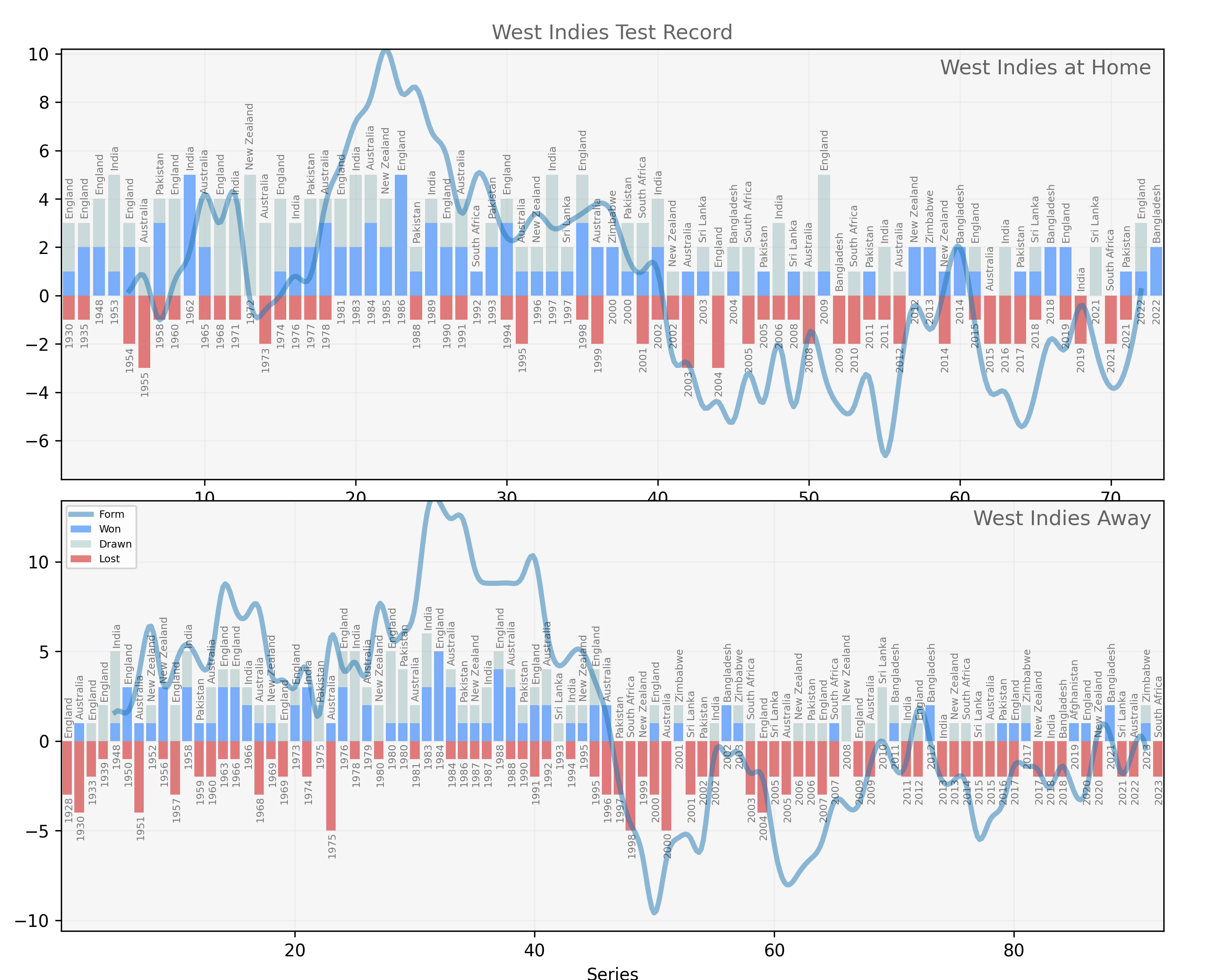
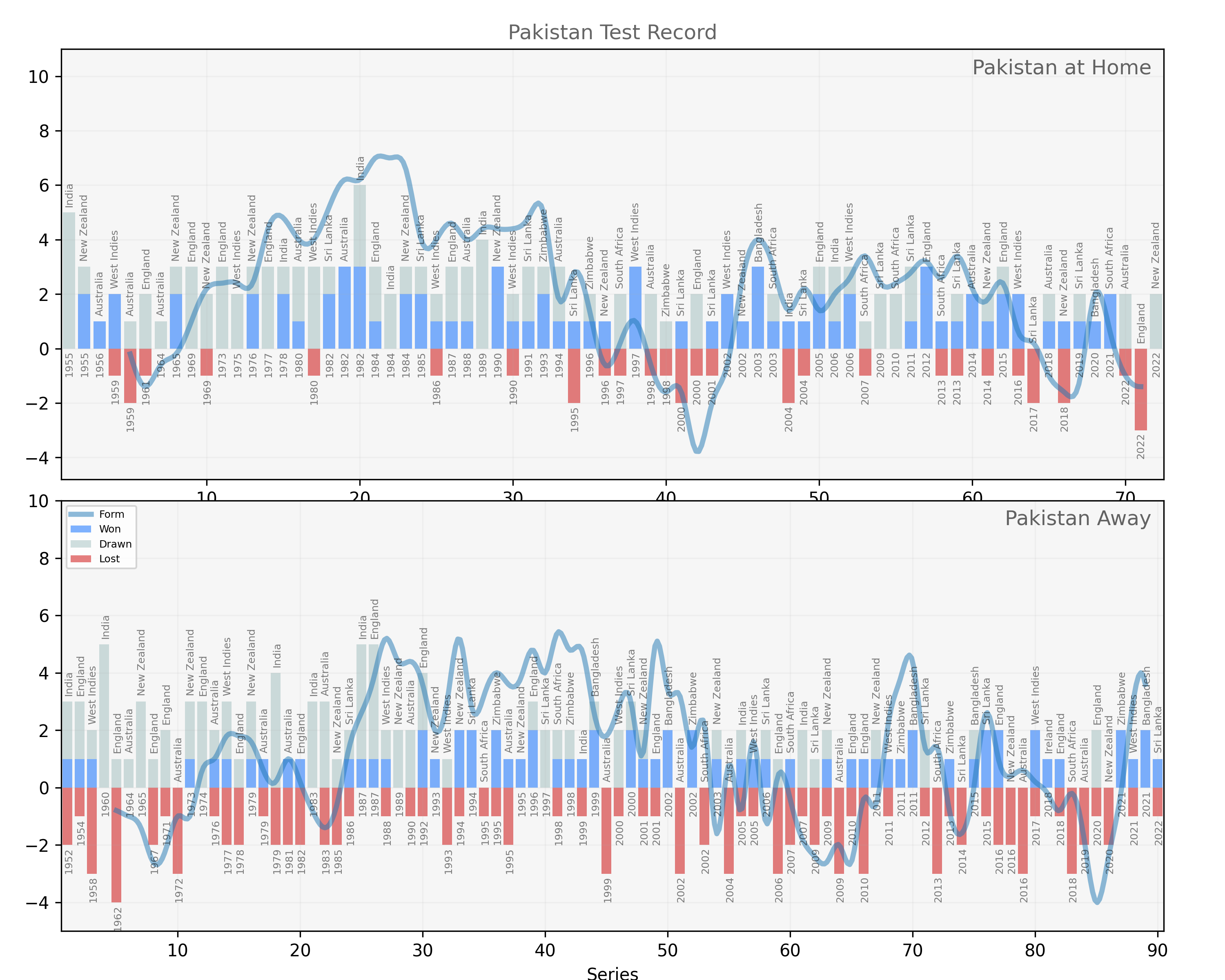
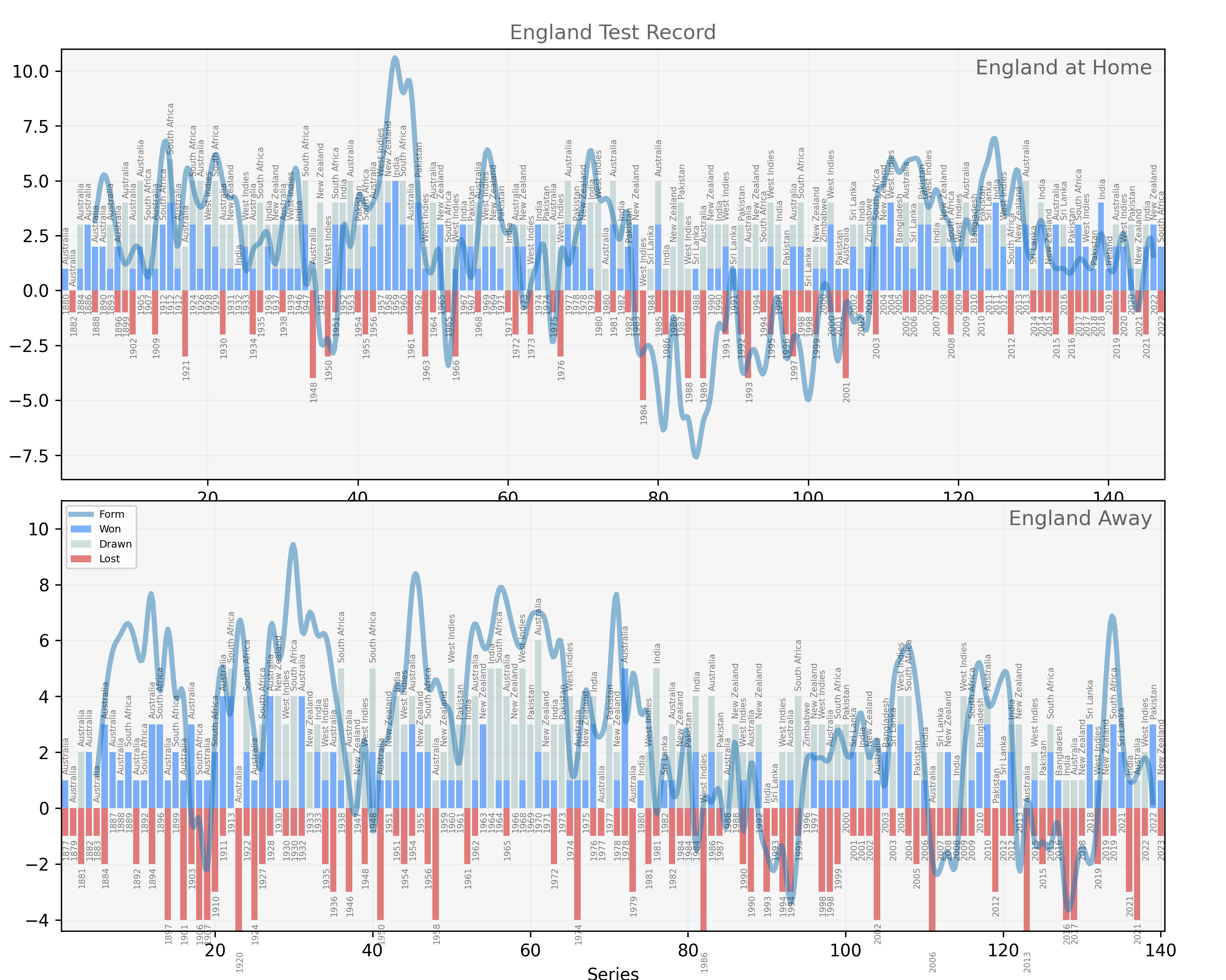
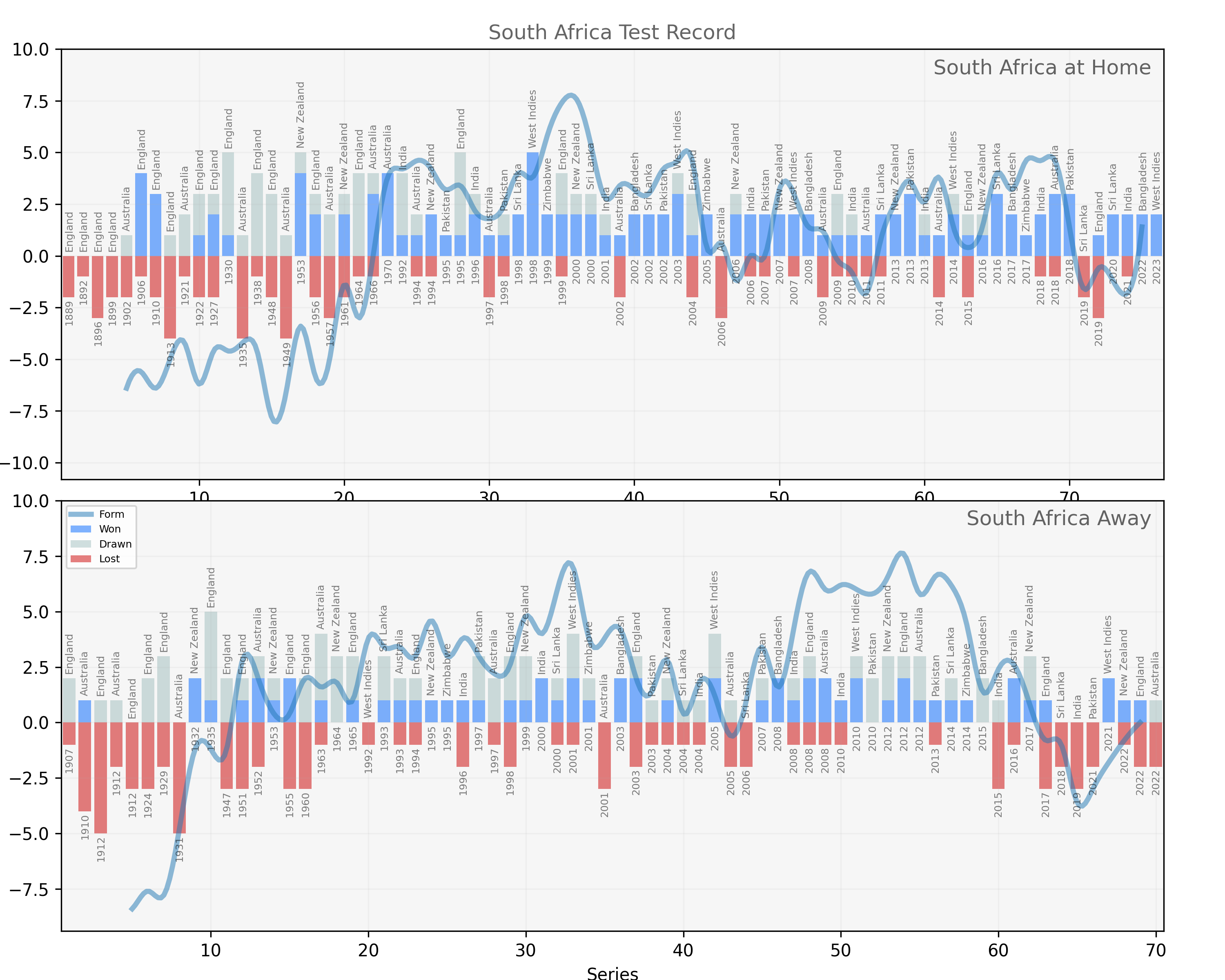
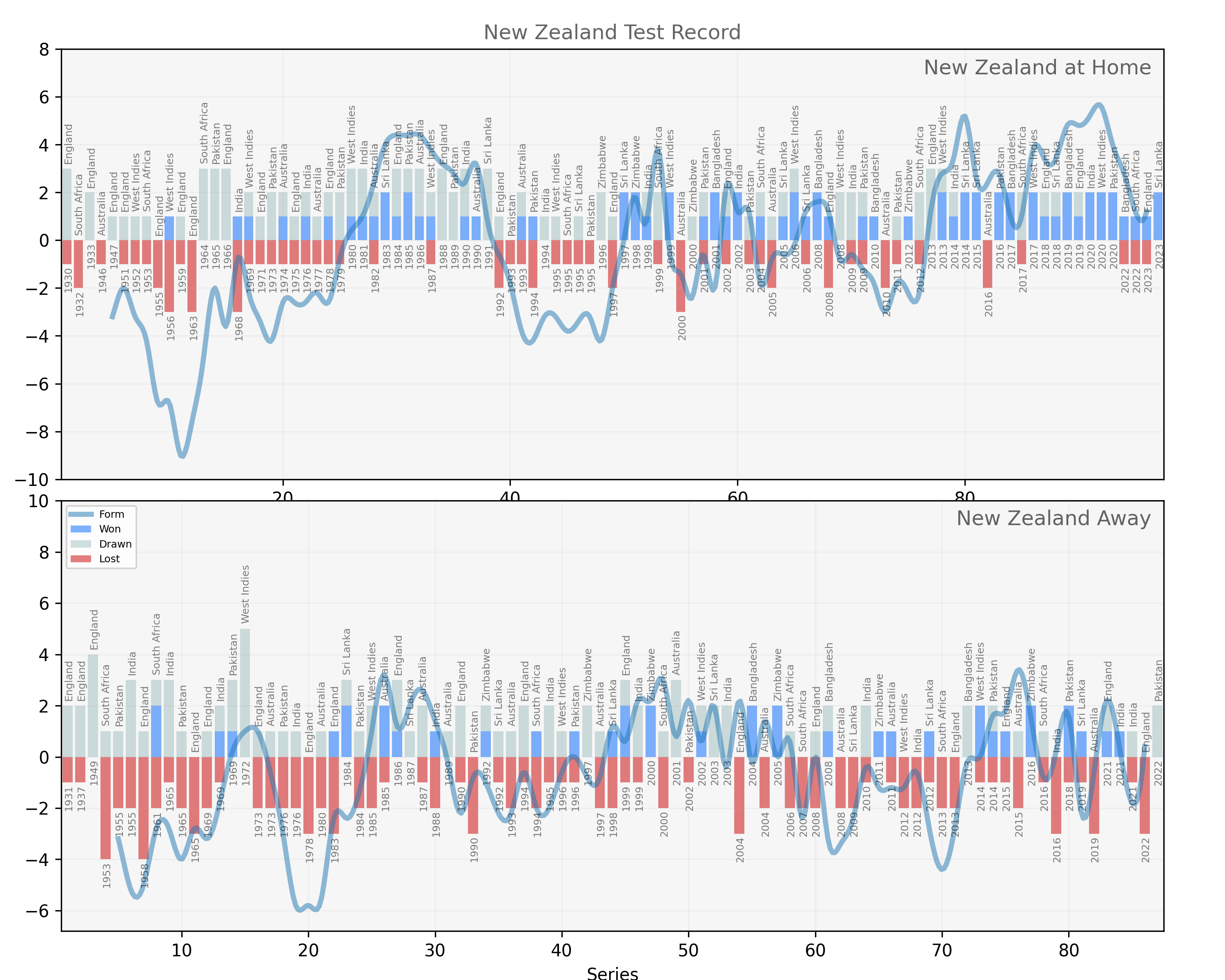
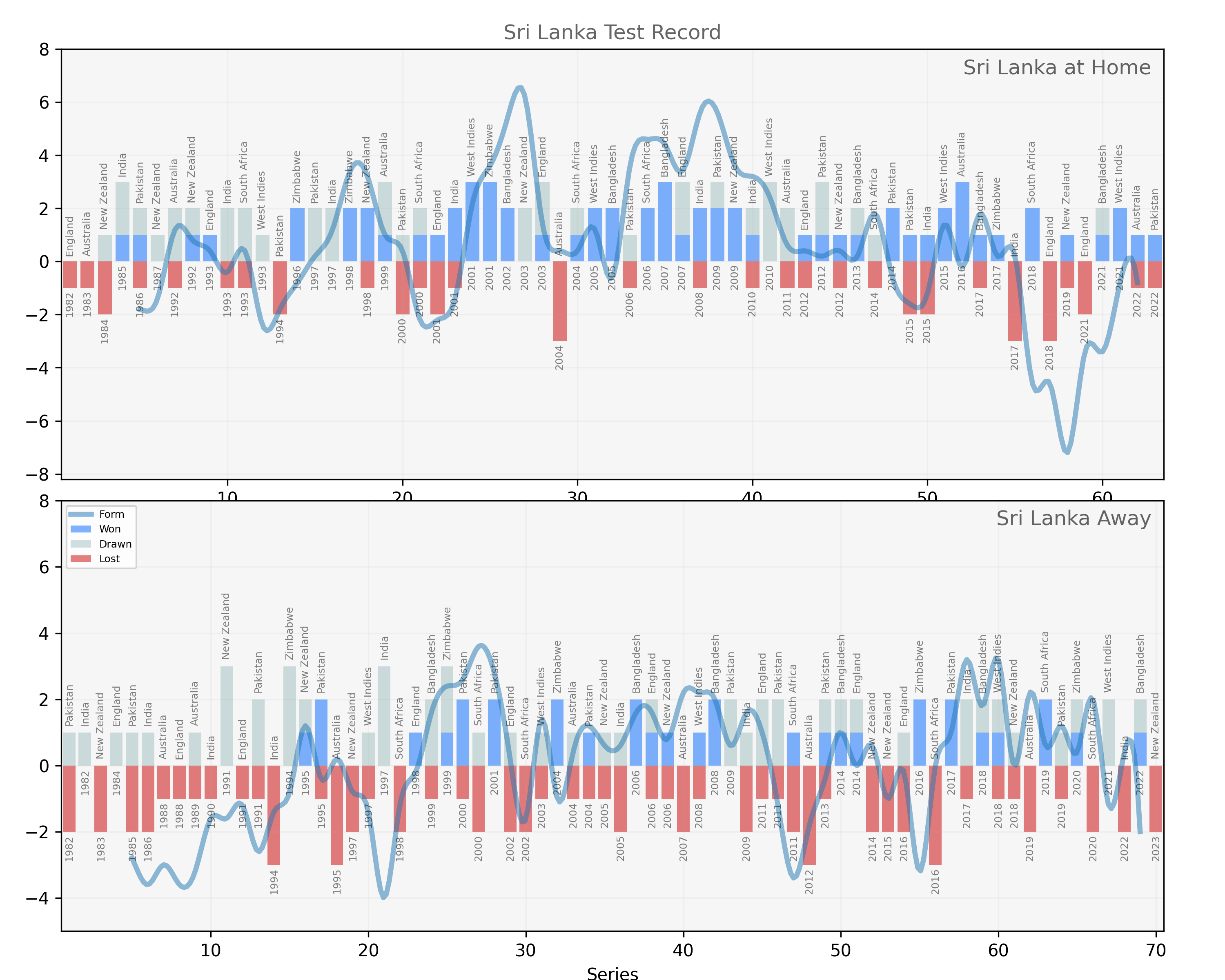
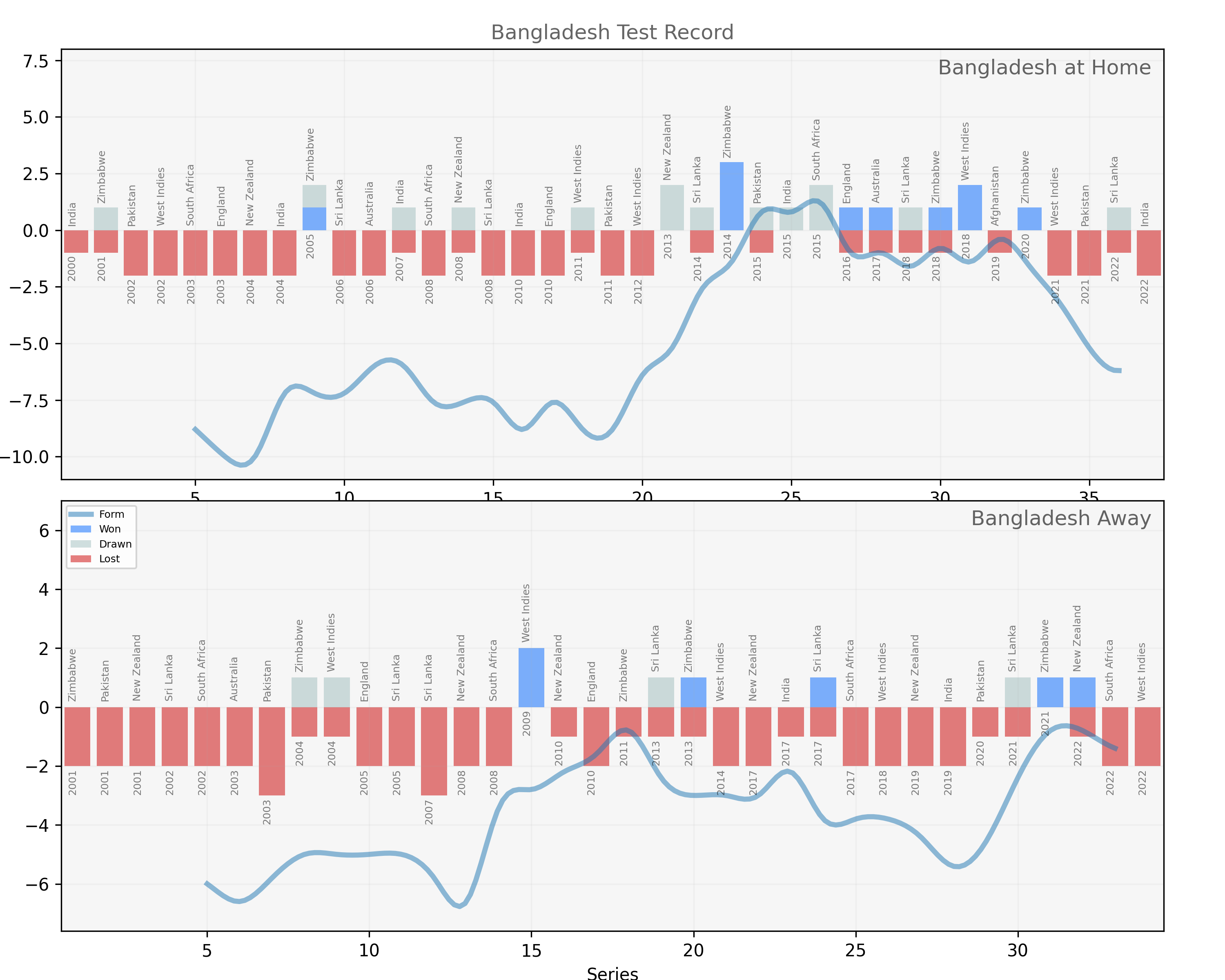
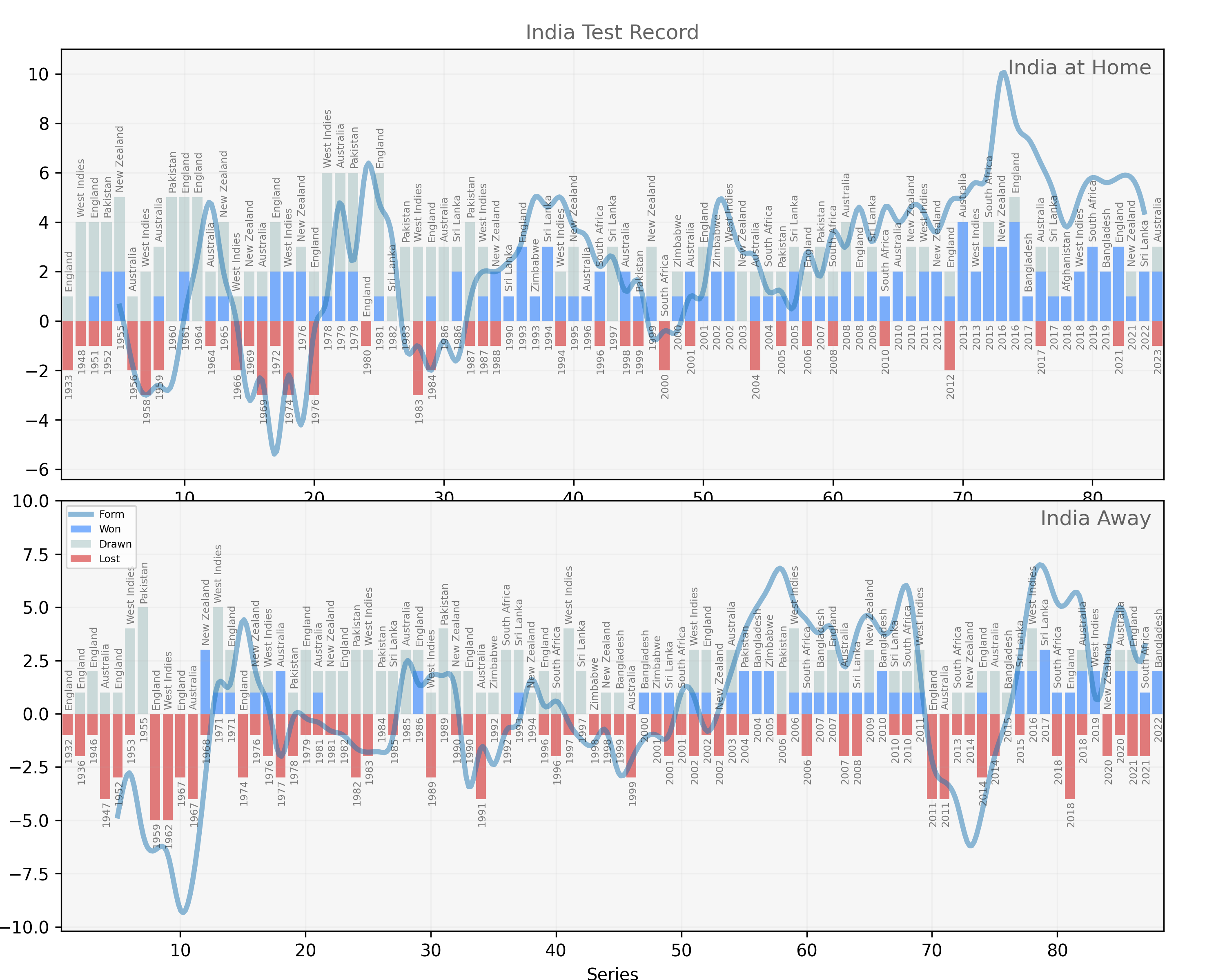
First, here is the objective description of the data. Each visualization maps every home or away test match played by a nation in their entire history. Each bar represents all the tests played in a series (the year is at the bottom, the opposing or “touring” team at the top). Wins are blue, losses are red and drawn matches are gray. So far, so simple. The wavy blue line is a running average indicative of “form” that scores a home win as 3 points, a home loss as minus 5 points and a home draw as 1 point. Away, the scores change slightly: an away win is 5 points, and a loss away from home is only minus 3, while draws remain unchanged. These are the facts of how to read the graph. Are they sufficient?
Quite apparently not. Fans of other sports would certainly be familiar with home-field advantage, but might wonder if it’s enough of a factor to merit a whole separate graph. Those with “domain knowledge” about test cricket might explain that several factors contribute to home advantage in test cricket including the weather and the pitch. The ball swings and seams (moves in the air and off the pitch) more in England, spins more off the dry pitches of the Indian subcontinent and bounces more on the fast wickets of Australia. Home teams know their conditions better and can custom make pitches to suit their strengths. So much so that often a team’s home and away performances will differ widely. An all conquering team at home – like India in the 1990s – couldn’t be called a truly great side until it dominated abroad as well. Hence, two graphs. But notice, the moment we stepped into the comforting assurance of domain knowledge we entered a realm of subjectivity and interpretation – things on which reasonably informed people might disagree.
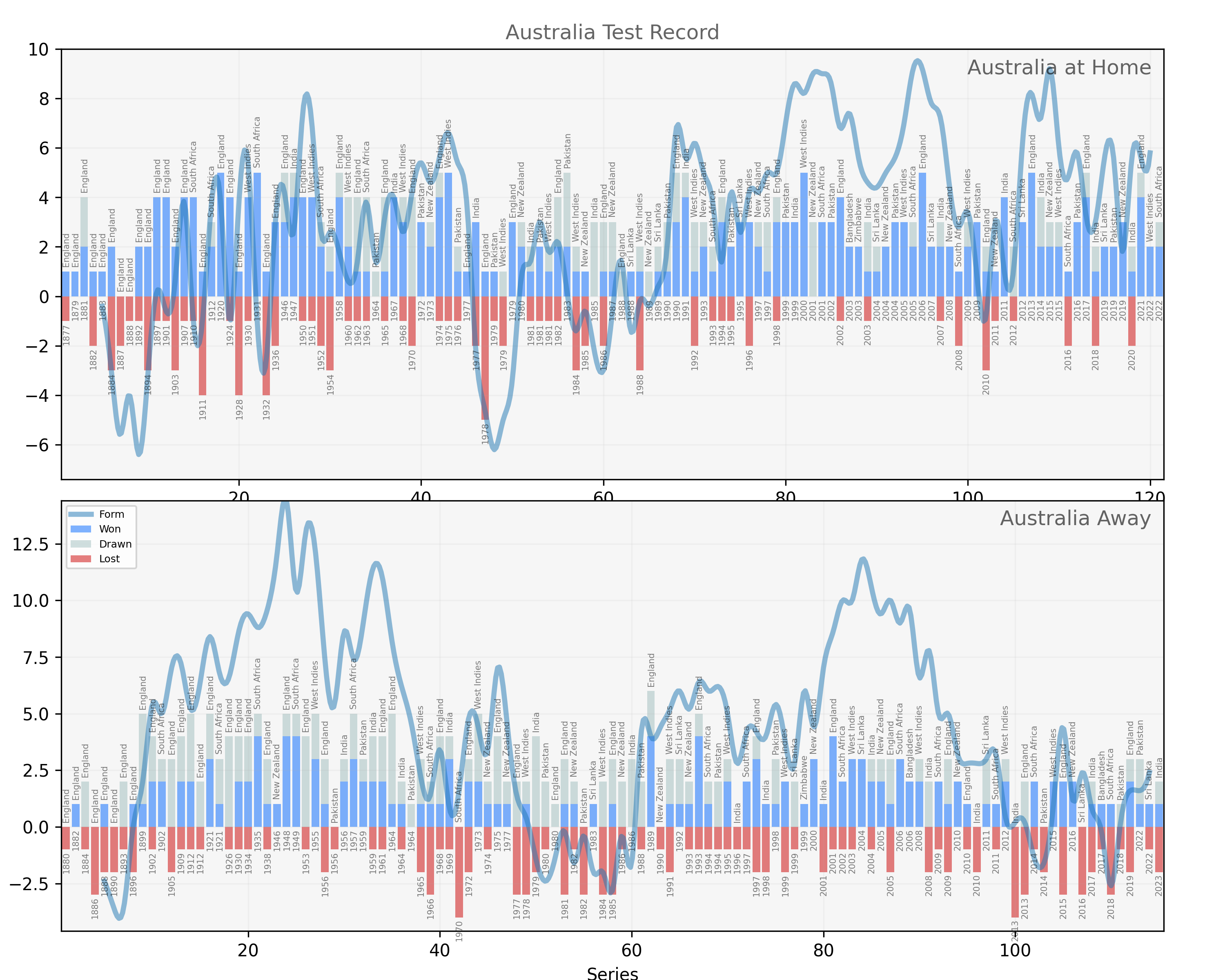
Now that the utter dispassionate objectivity of our data (“here are the results of every test match played by Australia”) looks slightly shaken, let us stir it further. Which parts of the graphs are objective facts and which more interpretive? Surely, the results of the test matches are objective. Well what if the “objective” facets of the data flattens nuance one might care about? A cowardly draw settled for because a team refused to chase an enticing final innings target is not the same as a valiantly achieved tie off the last ball. Well, the data-scientist reminds us, we are dealing with results, not some abstraction such as glory. To say that in the 1960 tour of Australia, the West Indies team lost two matches, drew two, and won one is a clear statement of what happened. Yes, of course. But one might care for more dimensions than are captured in the bare surface of the data. One of those drawn matched was the first tied test, and the closely contested matches in this famed “Calypso series” would signal the first phase of West Indian ascendency.
This is not to say that at least some aspect of the frustratingly qualitative and subjective category – “glory” let’s call it – involved in so many not-quite-victorious sporting causes could not be captured in a visualization. We might shade matches by margin of win for example. Or take the opposition ranking and form into account. This is what something like a Elo ranking system (most widely known in FIDE chess rankings but used elsewhere including in cricket rankings) does. But notice that adding rhetorical nuance in one aspect would probably come at the cost of clarity in another. The graph already shows a massive number of data points – every match ever played by a team. Adding shades (or perhaps weighted widths or heights) would likely make it extremely cluttered and hard to read, like overwhelming a gripping narrative with rambly footnotes.
So I chose a slightly different compromise. Separate out the objective part of the data from the more interpretive narrative I want to weave. The results of the matches remain untouched, but are overlaid by a form curve that tries to capture the ebb and flow of the fortunes of national teams, their flights of glory or depths of disappointment. This overlay is computed using the scoring system noted above – it isn’t some magical subjective quality, it comes “from the data.” But one couldn’t argue that it is objective in the same way as the rest of the plot. Any serious cricket fan is likely to have differences with my scoring scheme. Away draws should carry more weight than home draws. The quality of the opposition should be taken into account. When a team wins in conditions most different from their own, that should be noted. First away victories are more monumental occasions. The nuances might be endless, and we might quibble on them. But the point is that these are nuances, subject to interpretation, rooted in, but a projection from the facts.
So, enjoy my attempts at depicting a massive quantity of information in a way that is tractable and yet to try and tell a story with it that helps the viewer see the quick contours of the vast over a century old landscape of this wonderful sport. Look at the Statsguru result table for the West Indies to get a sense of how difficult it is to grasp a team’s fortunes from the raw data, and compare it to story of rising swagger in the mid sixties followed by almost two decades of supreme dominance home and away playing cricket of sublime beauty and lethal precision. There are many more narratives in the graphs for the other teams below – plots and subplots, struggles and redemptive moments – in here. I will leave you to find them as you enjoy the plots and perhaps complain about how it limits or hides important aspects of the data. But when you do complain, notice how what you are complaining about is enmeshed in the rhetorical capacities of data and its visualization.